Arcforce
UX & UI DESIGN# MOBILE
App store:Arcforce
Duration: 2021 - 2022
Genre(s): 3V3 Hero Shooter
Platform(s): Mobile
Tool(s): Unreal Engine 4
Production stage: Cancelled on Aug.2022
Position: Director of UX & UI
My Role:
- Owned design direction
- Ran review and feedback across the team
- Led user research engagement
- Set the UI style guide.

Introduction:
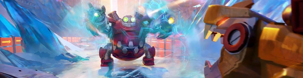
A new team-based arena PVP shooter designed for fast action on mobile devices and featuring powerful heroes. Experience a vibrant, futuristic world teetering between utopia and dystopia, where unlikely teams of misfit warriors will arise to wage warfare and clash in furious 3v3 battles.
UX&UI Team:
Hassan Ijtaba; Aleksei Kovalev; Elizaveta Kushnir
Underdevelopment trailer from 2022
The problem
Entering a hero-shooter genre with entrenched competitors and an audience — Gen Z mobile players — with specific, fast-moving aesthetic and pacing expectations. Unlike my other projects, there was no legacy system to fix here; every UX, visual, audio, and VFX system had to be built from a blank canvas.
The Challenge
Business goal: Successfully position a new IP in a crowded, competitive genre — differentiated enough to earn attention against established hero shooters, with a design system that could scale as the hero roster grew.
User problem: New players needed to read fast, split-second combat — ally vs. enemy, ability cooldowns, hero identity — on a small mobile screen, without the UI competing with the action itself for attention. On mobile, there's no room for a HUD that makes players think before they react.
Constraints: A 3-person team responsible for five disciplines (UI, animation, VFX, audio, camera) simultaneously; content (heroes, modes) still evolving under us, meaning any system too tightly coupled to specific content would need constant rework; and a genre where competitors had years of iteration we didn't have time to match feature-for-feature.
Process
Research → Define → Framework → Systems Design → Review & Iterate.
Research
Competitor Analiysis
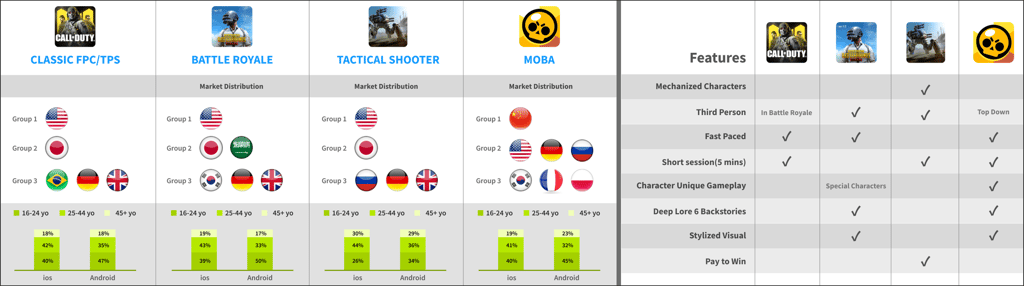
We started with competitor analysis and target-audience research, used that to define a visual language and core-loop framework, then translated the framework into concrete design systems across UI, animation, VFX, audio, and camera — reviewing and revising continuously against playable builds until the project was cancelled.
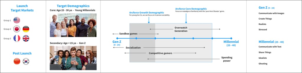
Target Audience Selection
The insights gained from our competitor analysis profoundly influenced our decisions regarding the target audience for our game:
We gained a clear understanding of the preferences of players in this genre, such as preferred game modes, pacing of the game, and the complexity of controls. Analysis of existing games helped us identify demographic trends, such as age groups, gender distribution, and geographical popularity, guiding us in tailoring our game to the most receptive audience.
Understanding our target audience enabled us to design a user experience that was specifically tailored to their preferences. This included aspects like control schemes, visual design, and the overall difficulty level of the game. We could position our game to appeal uniquely to these players, setting us apart from competitors.
Key Decisions
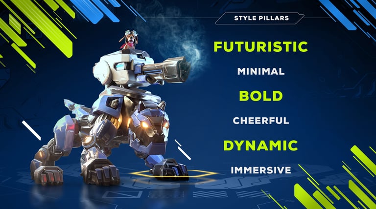
A visual language built for Gen Z, not genre convention
We set the visual direction toward a bold, high-contrast, socially-native aesthetic — vibrant color palettes and expressive style pillars closer to what Gen Z sees and shares on social platforms than to genre norms.
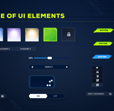
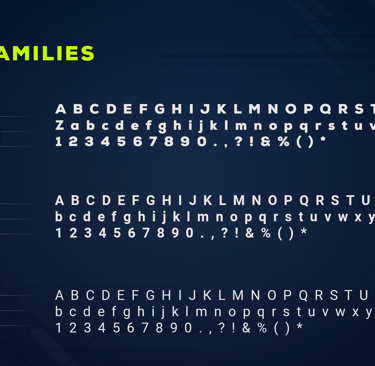
A documented style-pillar system, color palette, typography, and component library that the team could apply consistently across dozens of future hero kits without relitigating the visual direction each time.


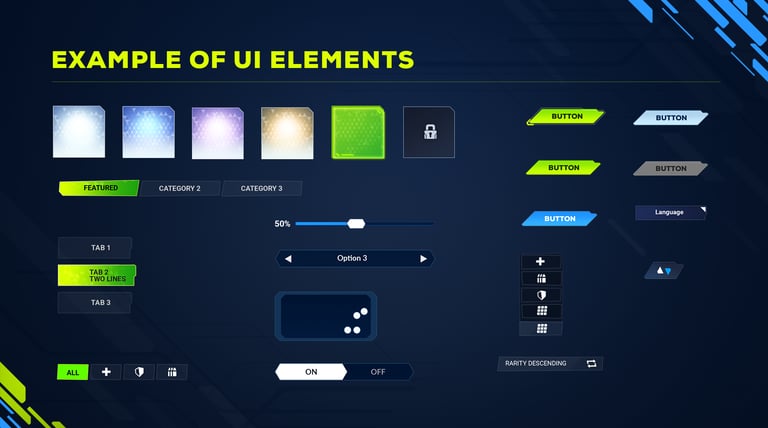
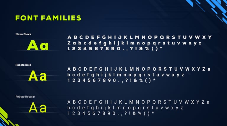
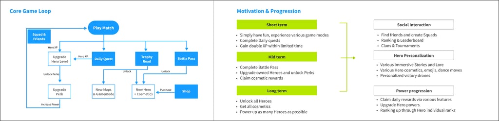
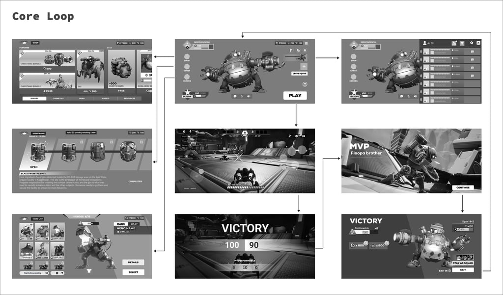
Tying UI structure to the core loop, not to specific content
Content — heroes, modes, progression details — was still being defined while we needed to design the UI around it. A UI built around today's specific content would break every time content changed.
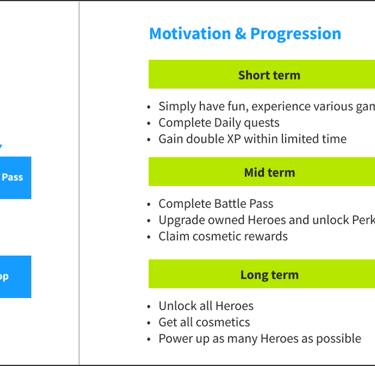
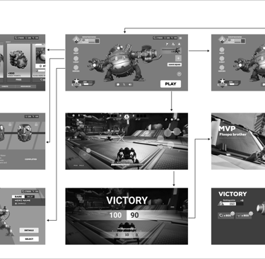
I anchored the UI framework to the core gameplay loop and progression structure itself (short/mid/long-term goals) rather than to individual screens or specific hero kits. A framework tied to the loop stays valid as content evolves; a framework tied to today's roster doesn't. This decision bought the team stability while the rest of the game was still in flux around us.
Final design: An information-delivery framework specifying what a player needs to see at onboarding, mid-game, and veteran stages — built to absorb new heroes and modes without a redesign each time.
"Quiet" as an explicit HUD principle
Fast 3v3 combat on a small screen leaves no room for a HUD that competes with the action for a player's attention — every extra visual costs reaction time.
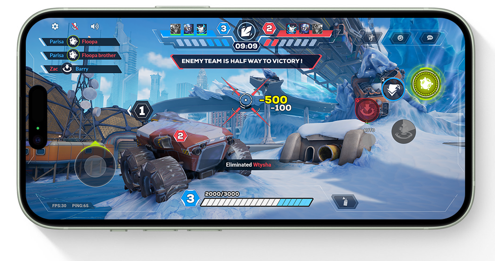
Final design: A HUD with minimal always-on elements, contextual surfacing rather than permanent clutter, and consistent color/action mapping across the interface.
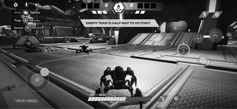
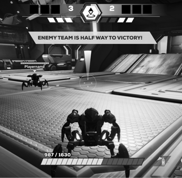
I set three explicit, non-negotiable HUD principles — Informative, Consistent, Quiet —
Informative :Give player the info they need WHEN they need it
Consistent:Strive for Consistency in Actions and Colours
Quiet:Don't steal the thunder from gameplay, be quiet
Animation principles:
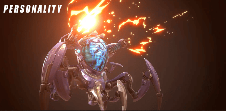
Clarity: Clearly communicate game mechanics and feedback to players, enhancing understanding of the gameplay.
Responsiveness: Provide immediate and intuitive feedback in response to player actions, ensuring a seamless and interactive experience.
Engagement: Use animations to create visually appealing and emotionally resonant experiences, increasing player immersion and enjoyment.
Strict color-coding for combat legibility at scale
Problem: Players needed to instantly tell ally from enemy abilities mid-fight, and each hero needed a distinct identity — without VFX and audio becoming an unreadable mess as the roster grew.
Solution: I mandated strict, non-negotiable color separation for ally vs. enemy VFX, governed by four consistent properties (shape, movement, duration, color), plus distinct per-hero audio cues built around clarity and immersion rather than novelty for its own sake.
Why this approach: Hero shooters live or die on combat readability. Without a system enforced from the start, VFX and audio would drift into inconsistency as more heroes shipped — and by the time that became visible, it would be expensive to unwind.
Final design: A documented VFX color-coding standard and audio-identity principles (distinctiveness, clarity, immersion) applied across the hero roster and camera behavior.


Visibility: Ensure VFX are distinct and visible enough to clearly indicate different abilities and effects, without overwhelming the scene.
Consistency: Maintain a consistent visual language across all VFX to help players quickly understand and react to various game elements.
Enhancement: Use VFX to enhance the gameplay experience, making actions and abilities feel more impactful and satisfying.
Audio Principles:


Distinctiveness: Ensure each hero's audio cues are unique and recognizable, allowing players to quickly identify different characters and abilities by sound alone.
Clarity: Clear and precise, providing immediate and understandable feedback on actions and events within the game.
Immersion: Enhance the thematic elements of each hero, contributing to a more immersive and engaging gameplay experience.
Camera principles:
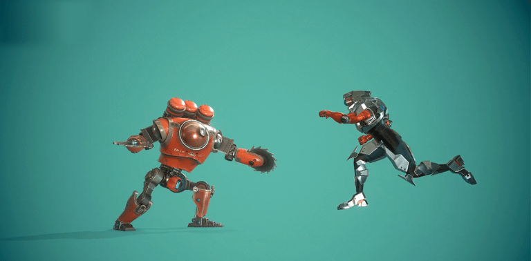
Clarity of Action: Camera positioning allows players to clearly see and understand the action, especially in relation to their hero's abilities and interactions with others.
Stability: Maintain a stable and smooth camera movement to avoid disorientation and ensure a consistent gameplay experience.
Responsive Adjustments: Dynamically adjust to different situations and abilities, providing the best view for each scenario without obstructing gameplay.
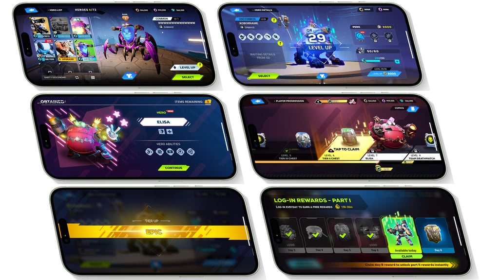
Some UI Screenshot
UI Artists: Alexey Kovalev, Elizaveta Kushnir, Hassan Ijtaba
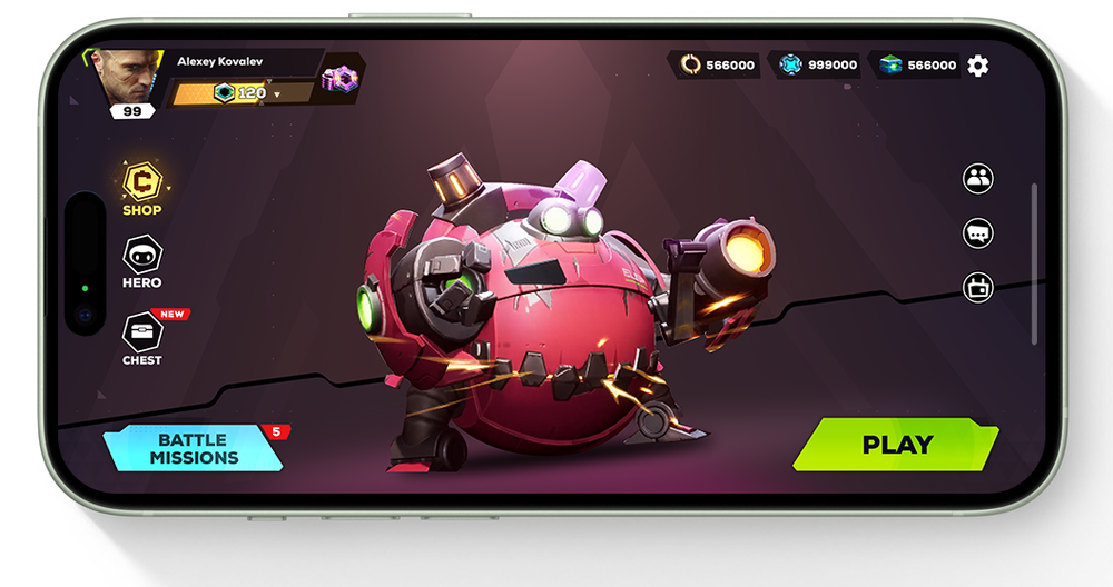
Underdevelopment gameplay video from 2022
Outcome
Final product
A complete foundational design system — UI, animation, VFX, audio, and camera principles — plus playable HUD and menu screens, validated against internal builds and an underdevelopment gameplay trailer.
Results or user feedback
Arcforce was cancelled in August 2022, before public launch, so there's no live retention or launch data to report — I won't manufacture numbers that don't exist. What I can say honestly: the systems held up under continuous internal review and iteration against playable builds up to that point, and the framework was built specifically so it wouldn't need to be redesigned every time new content shipped.
What I learned
Building foundational systems for a genre you're entering cold is a different discipline than optimizing an existing one — you're making calls that will constrain a roster you haven't designed yet, with no player data to lean on. The lesson I carried forward: invest early in explicit, principle-based systems (not just screens) specifically because you can't predict everything the content team will need later — and a cancelled project doesn't erase that discipline. It's the same instinct I've applied on every project since, on titles that did ship.
