
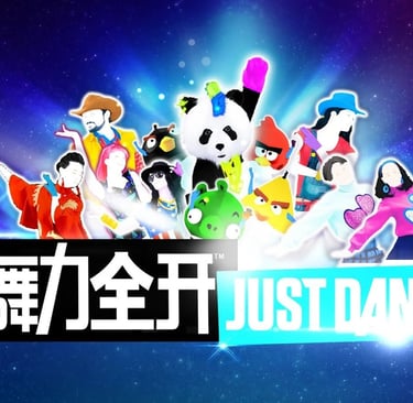
Date: 2015 - 2016
Developer(s): UBISOFT
Genre(s): Online-Dancing
Tools: Unity 3D
Platform(s): Tablet, TV, Mobile, Web
Position: Senior UX Designer
My Responsibilities:
- Own and drive the UX design
- Information architecture, menu flow & hierarchy,wire-framing, prototyping.
- User testing & Research plan and engagement
Introduction:
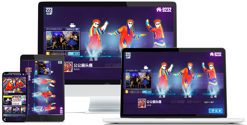
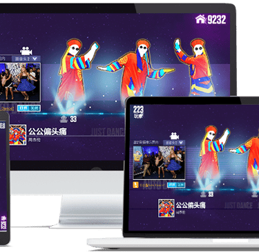
Just Dance Now (CHINA) is a multi-platform online dancing game, targeted to Chinese market. It brings the biggest music video game franchise of all time, without needing a console. All the player needs is an internet-connected screen and a smartphone as a controller.
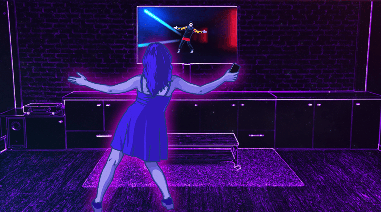
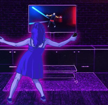
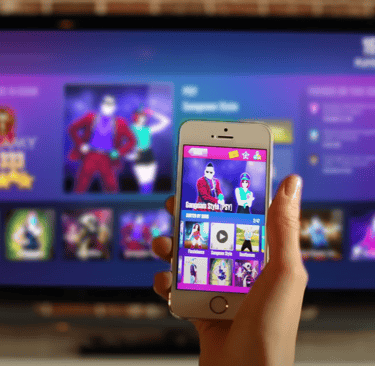
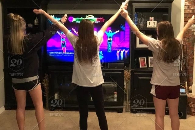
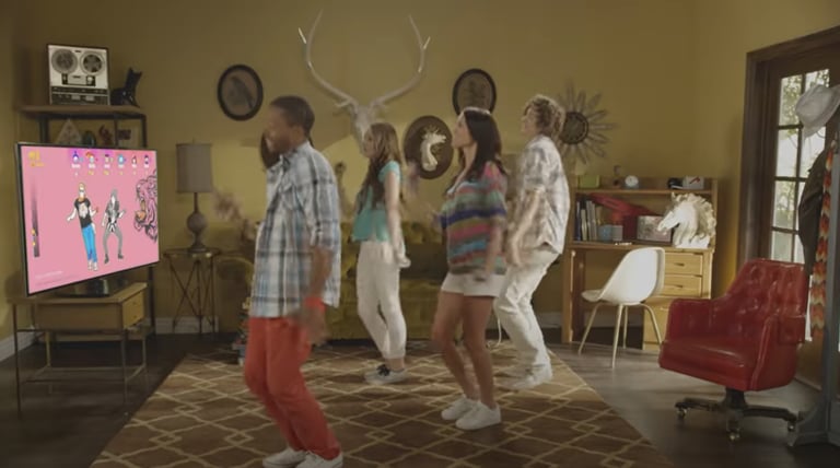
The player needs to pick a song from the catalog of over 500 tracks, hold the smartphone in the right hand and follow the dancer on the screen! Their movements are tracked and scored by the game, by perfect those moves to get a perfect score!
There is no limit to the number of players you can dance with! Your friends and family can jump in at any time for even more fun.


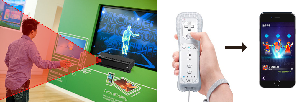
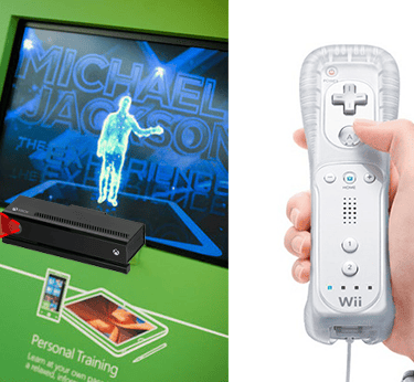
Ubisoft wanted to bring its biggest music-game franchise into China — a market where console gaming had only been legal since 2014, where mobile was the dominant platform, and where the entire premise of Just Dance (motion-tracking hardware like Kinect or a Wii Remote) had no local reference point.
I owned the UX end-to-end — IA, flow, wireframes, prototyping, and the research plan to validate it.
Rather than walk through this chronologically, it's more honest to walk through the four questions that actually decided whether the product worked. Everything else was downstream of these.
Can a phone become a controller without a manual?
Early research surfaced the real risk before I'd drawn a single wireframe: players couldn't parse the connection between a mobile phone and dancing at all.
This wasn't a discoverability problem you fix with clearer icons — players had no category in their heads for "your phone tracks your body."
We need to anchor every onboarding screen around a single message, "your smartphone turns into a controller and tracks your moves," and held every early design decision accountable to whether it reinforced that one idea. In testing, once that belief clicked, setup and play became close to effortless. Until it clicked, nothing else in the product mattered.
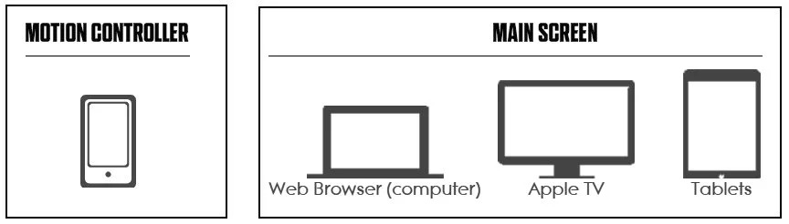
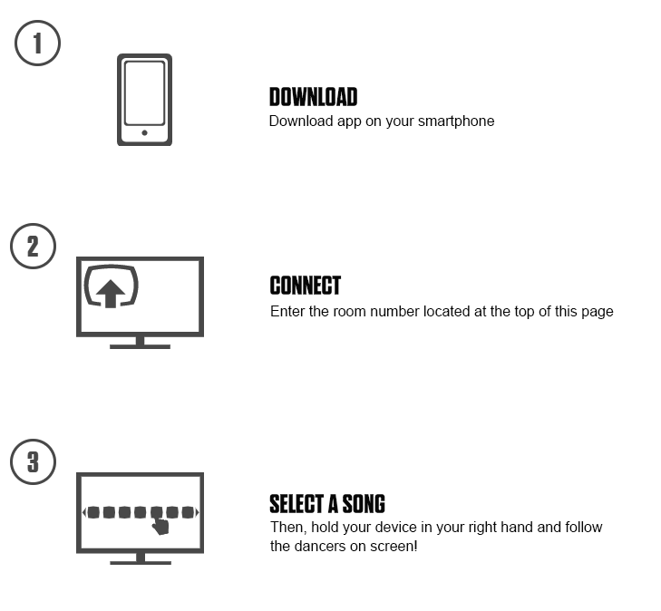
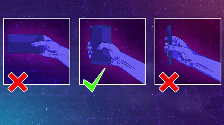
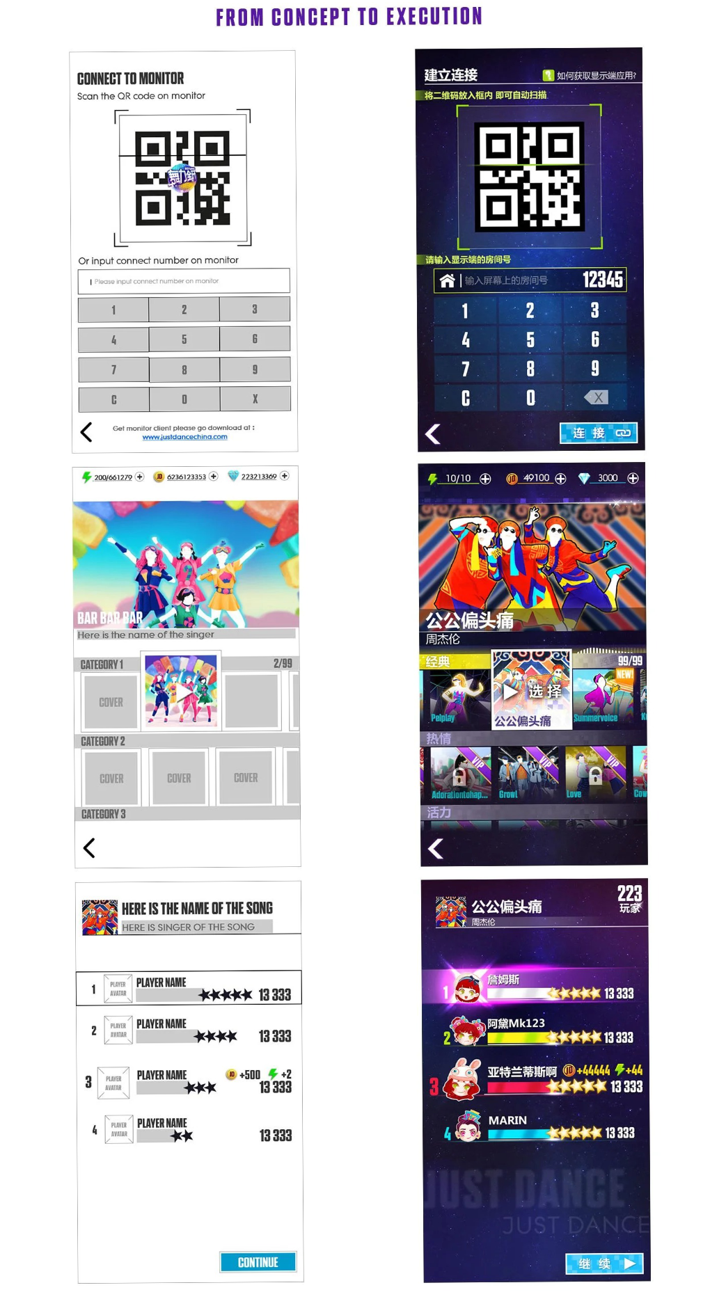
Once players grasp the idea of using their smartphone as a motion-tracking device, they find following the straightforward installation guide effortless.
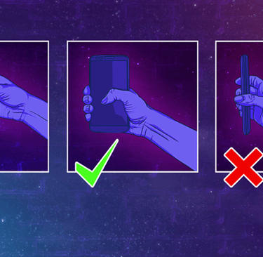
They simply need to hold their phone firmly in their right hand, as shown in the instructions, and they are ready to dance.
Thanks to the familiar use of QR codes and room codes for connection, everyone present can easily join the game.
Can two screens feel like one experience?
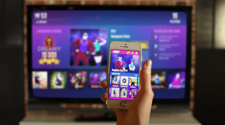
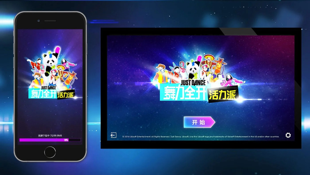
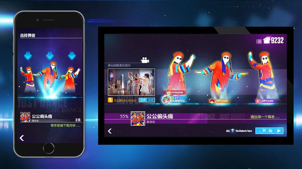
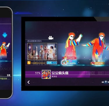
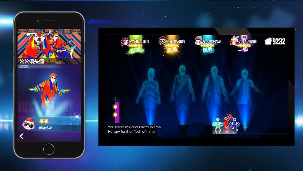
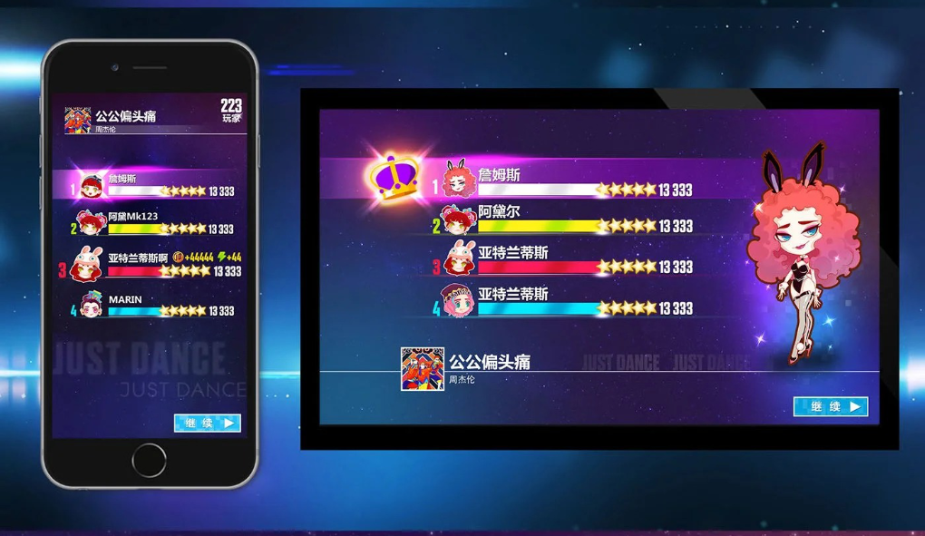
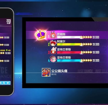
Players needed to hold a phone in one hand while dancing and simultaneously track a shared screen across the room — a divided-attention problem with no existing local pattern to borrow from. I designed the phone and the TV/tablet/web screen as a single interaction system rather than two separate surfaces: hand-tracking feedback had to be immediate enough to trust mid-dance, and the shared screen had to always reflect what the phone was doing in real time. Treating them as one system, not two, is what made the "phone as controller" concept feel real instead of gimmicky.
Can everyone feel engaged even when only one person is choosing the song?
Only one player controlled song selection, but a party where four people are staring at one person scrolling a list on their phone doesn't stay a party for long. I built real-time synchronization so the shared screen always showed what the host was browsing — everyone could see and hear song previews as they came up, even without control over the choice. It's a small feature with an outsized effect on whether non-controlling players stay engaged or check out.
The Thread
Every one of these four questions resolved the same way: when adoption risk was highest, I chose the option that reduced unfamiliarity, even when a more novel solution existed.
That's not a coincidence — it's the same call I've made on every project since, including much larger ones. It's easy to see in hindsight; it wasn't obvious at the time, especially with unlimited enthusiasm on the team for a more inventive pairing flow.
What I don't have from this project is post-launch retention or funnel data — only pre-launch validation that the concept worked. If I ran this today, I'd instrument a "time to first dance" metric from install to first completed song, so the impact of solving these four questions could be shown in usage data, not just research-stage confidence.
SOME WORK EXAMPLES
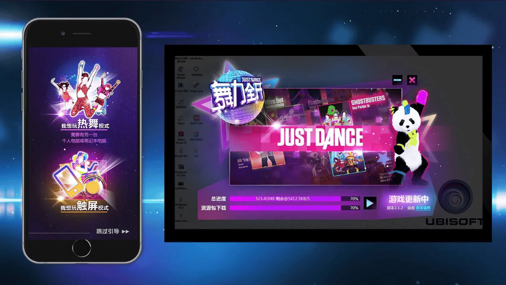
UI Artists: Jianing Wang; Wenjun Dai; Jiawen Chu; Yanxia He
Behind the scenes





Can a room full of friends become "in the game" in under a minute?
Getting a group connected was the single point in the funnel most likely to lose people — the more friends in the room, the more chances for someone to give up before the first song even started. Rather than invent a bespoke pairing flow, I used QR codes and room codes, a mechanism Chinese mobile users already trusted from other apps. At the highest-risk moment in the experience, I chose familiarity over originality on purpose.
Just Dance (China) - Crossplatform dancing
UX & UI DESIGN# MOBILE