Once Human
UX OPTIMIZATION# PC
Duration: March. 2023
Company: NetEase Games
Steam Store: Once Human
Platform(s): Cross-platform: PC, Console
Release date: Q3 2024
My Responsibilities: UX Audit with top findings and suggest fix
Introduction:
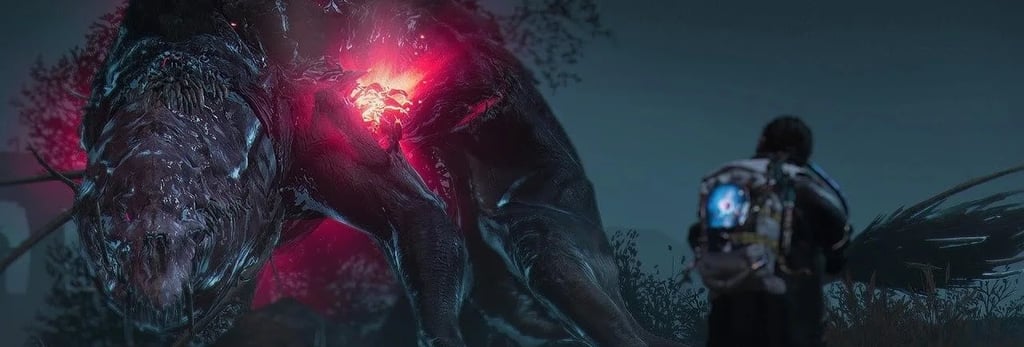
Once Human is a multiplayer open-world survival game set in a strange, post-apocalyptic future. Unite with friends to fight monstrous enemies, uncover secret plots, compete for resources, and build your own territory. Once, you were merely human. Now, you have the power to remake the world.

The situation:
Once Human was already in closed beta ahead of a Q3 2024 release, and players were describing the HUD as "chaotic." NetEase brought me in for a short, focused engagement — weeks, not months — to diagnose the root causes and hand the internal team a fix they could execute without me.
The outcome:
Diagnosed the HUD problem as two distinct failures — wrong timing and wrong placement of information — rather than treating it as a single "clutter" issue
Built two reusable decision frameworks (a Field of View system for HUD priority, a functional split for control prompts) instead of a one-off redesign, so the team could keep applying the same logic to new features after I was gone
The frameworks were adopted as the team's working standard for HUD and control decisions; the game shipped on schedule in Q3 2024
Why I Was Brought In
Once Human was already in closed beta, which meant the usual playbook — audit, then redesign — wasn't available. Any fix had to work within a live build, with minimal disruption, ahead of a fixed release window.
Two problems were converging:
The HUD had accumulated complaints of being "chaotic" from closed beta players, and the game's controls carried a PC-first design bias — built around a large number of dedicated keys — that hadn't been reconciled with console play.
NetEase needed someone to diagnose both quickly and leave the team with a way to keep fixing it themselves, since this was a bounded engagement rather than an embedded role.
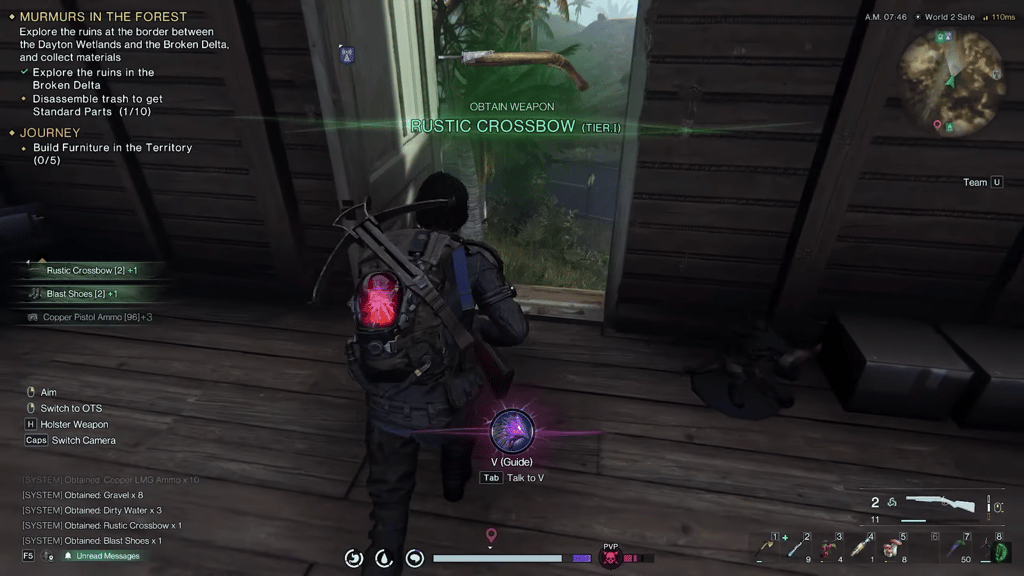
The old UI screenshot:
How I Approached It
I scoped the audit to root cause, not symptoms, because a full rebuild wasn't an option.
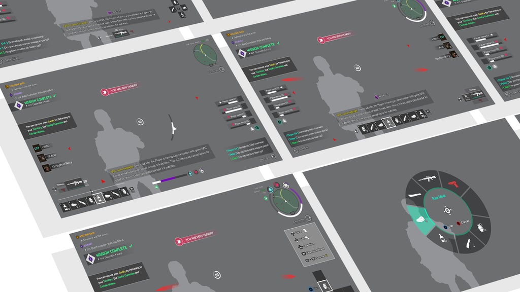
The instinct with a "chaotic HUD" complaint is to start trimming elements. Instead, I ran a systematic review against actual gameplay needs and found the real problem wasn't volume of information — it was timing and placement: data was shown permanently regardless of relevance, and prompts were overlapping combat-critical visuals. That reframing mattered because it pointed at a structural fix instead of a cosmetic one, which was the only kind of fix compatible with a closed beta.
I built a framework instead of a screen-by-screen prescription, because I wouldn't be there to make the next call.
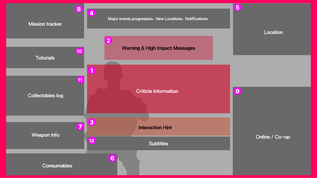
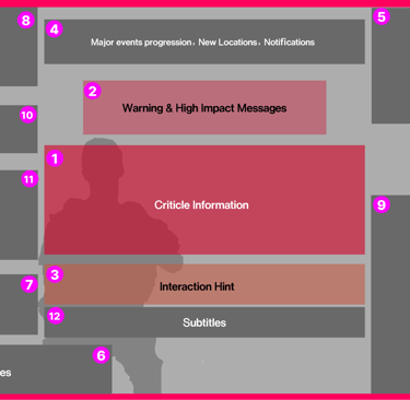
Rather than hand over a fixed set of "correct" HUD layouts, I defined a Field of View system — center-screen reserved for life-critical information, above-center for high-impact alerts, periphery for contextual secondary information — plus rules for when elements should appear and disappear based on combat state. That gave the internal design team a repeatable way to evaluate every future HUD decision without escalating back to me.
I made the same judgment call on controls.
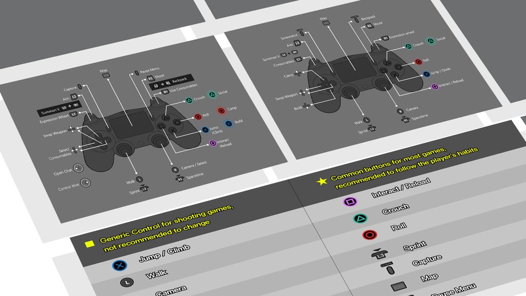
Rather than dictate specific button mappings, I split control prompts into two functional categories — basic actions, taught once during onboarding and then retired, versus feature controls, surfaced only when contextually relevant — backed by an always-available control-hint menu for players who forgot. This let the team reduce clutter immediately while keeping full control depth intact, which mattered because Once Human's mechanical complexity was a selling point, not something to design away.
I deliberately chose not to touch what wasn't broken.
I kept the game's existing, industry-standard control scheme rather than proposing something novel, and reserved flexible mapping only for Once Human's unique mechanics. On a title already in beta with real players building muscle memory, introducing unnecessary novelty would have cost more than it fixed.


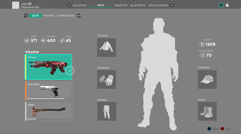
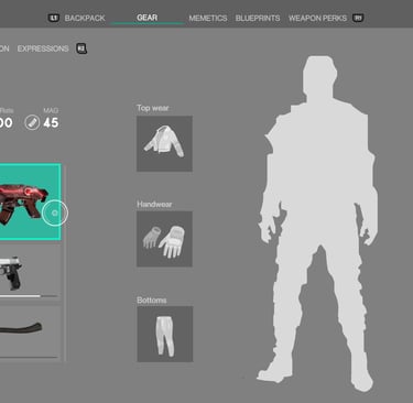
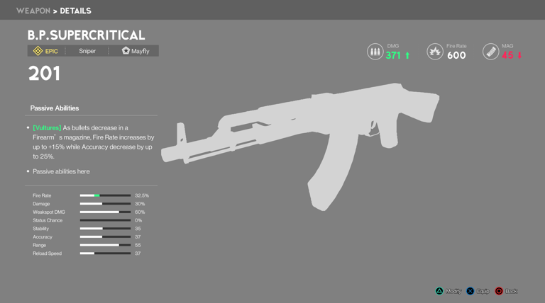
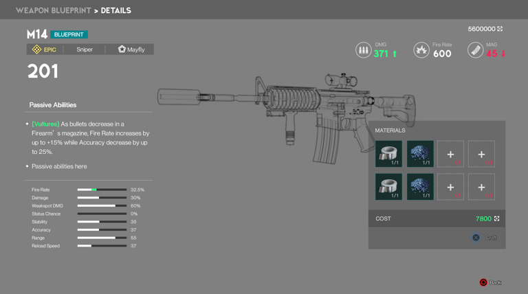
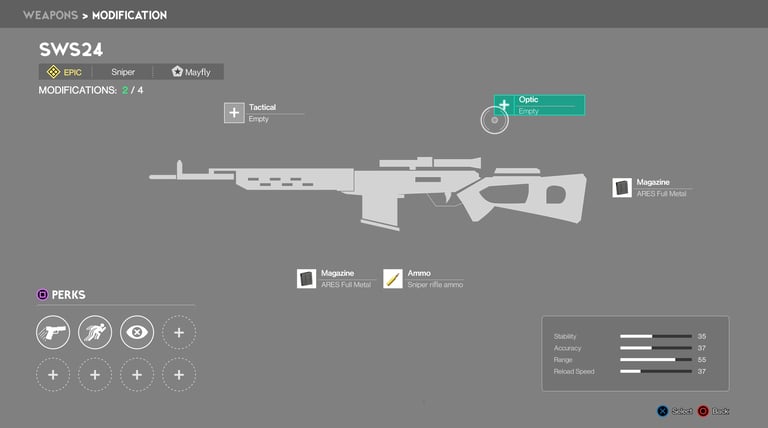
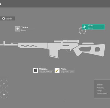
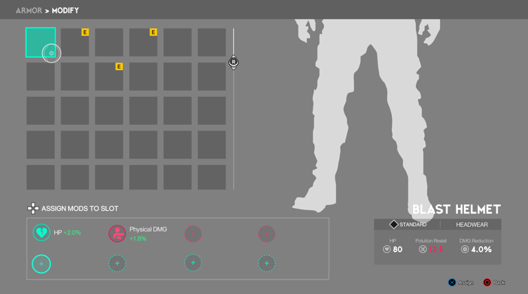
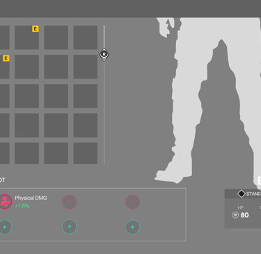
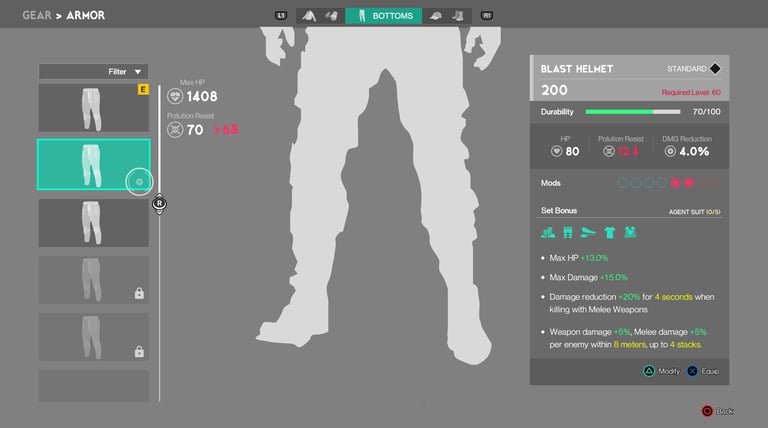
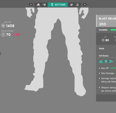
Cutomization
Versions that need to be optimized

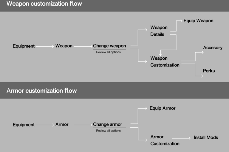
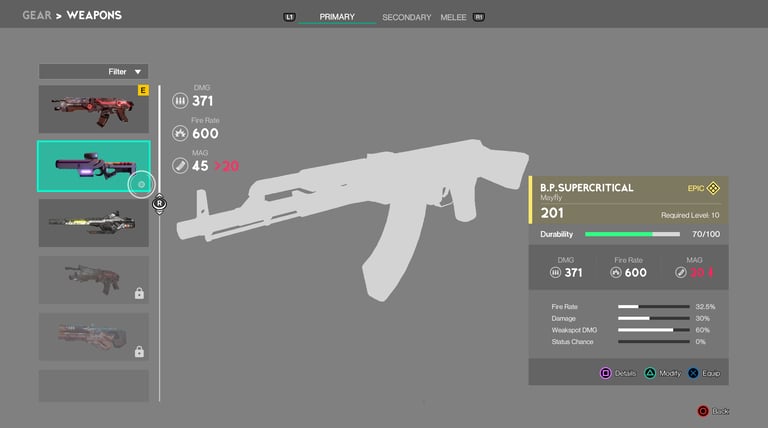
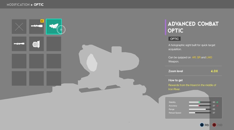
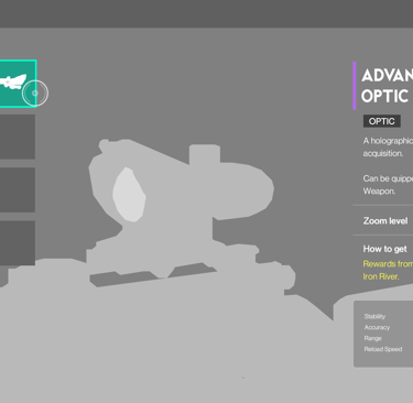
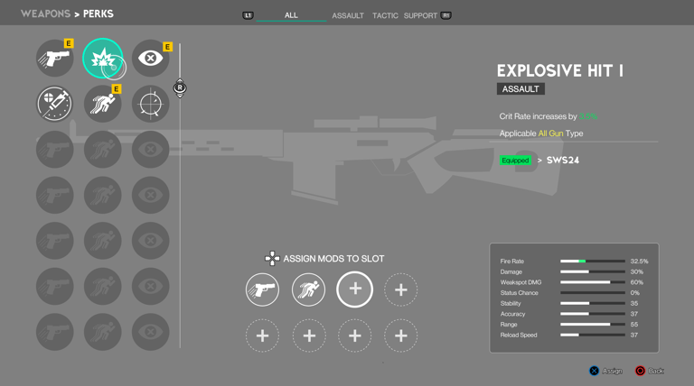
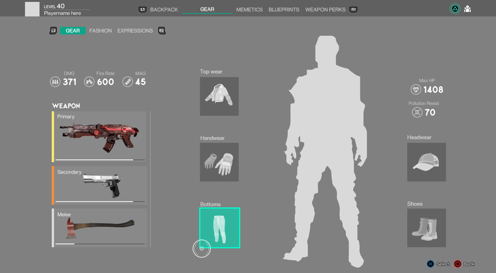
Optimization proposal: More intuitive and linear
What Shipped
Two adopted design frameworks — the Field of View prioritization system for HUD elements, and the functional split for control prompts — along with a customization flow proposal to make weapon and armor progression more linear. These were built explicitly as standards the internal team could keep applying, not a one-time set of fixes. The actual test of whether an external audit's recommendations stick past the engagement itself. Once Human shipped on schedule in Q3 2024.
Gameplay video

What I'd Do Differently
I'd have pushed to define a measurable success metric upfront — something like a HUD clarity score tracked in subsequent playtests — so the impact of the frameworks could be verified quantitatively after I was gone, rather than assessed only by whether the team kept using them.