Skull and Bones
UX GUIDELINE# CONSOLE & PC
Date: 2019 - 2020
Company:UBISOFT
Genre(s): Open-world,action-adventure
Platform(s): SonyPlaystation; Microsoft Xbox; PC
Position: Lead UX/UI Design
My responsibilities:
- Meta game Menu UX Guideline
- UX & UI weekly review
- Drive Social Feature Design

Introduction:
Skull & Bones is an action-adventure video game developed by Ubisoft Singapore and published by Ubisoft.
The game is released on 16. Feb. 2024. The game revolves around piracy and naval warfare.
The situation:
Seven years into development and a full gameplay pivot behind it, Skull and Bones' core menu system had absorbed years of feature requests from five co-development studios with no single owner. I was appointed to set the UX guideline that would bring 30+ designers across those studios into one coherent system — with no authority over any of them.
The outcome:
Consolidated 20+ competing menu features, each pushed by a different studio, into a clear 8-tab structure
Established one UX standard adopted across 5+ studios and 30+ designers with no reporting line to me
The framework held through to a 2024 commercial release, four years after I wrote it
Why I Was Brought In
By 2019, Skull and Bones had been in development for seven years and had undergone a major gameplay pivot in 2018 — the kind of restart that leaves an organization with more stakeholders than direction. The game's meta-menu, the screen every player would touch constantly, had become the place where that lack of direction was most visible: proposals were on the table for more than 20 main-menu features, each championed by a different game designer or studio wanting their system visible up front.
This wasn't a design problem so much as an organizational one. Five-plus co-development studios, thirty-plus UX/UI designers, none of them reporting to me, all needing to converge on a single menu architecture before the team could move forward with confidence. Leadership appointed me to own that convergence: define the standard, and get a distributed team to actually adopt it.
How I Approached It
I chose a bottom-up method because a mandate wouldn't have survived contact with five studios.
Rather than hand down an information architecture, I ran the restructuring as a card-sorting exercise with the game designers whose features were competing for space. Designers who help build the taxonomy defend it afterward; designers handed someone else's taxonomy look for reasons to deviate from it. That distinction mattered more than getting the "right" answer on day one.
I set a single design principle to arbitrate disputes I couldn't resolve by authority.
With that many stakeholders, disagreements about whose feature deserved prominent placement were inevitable, and I had no positional power to just decide. I established one standard —
"I know why I am here;
I know where I am;
I know what to expect"
— as the test every proposed tab had to pass. That gave every studio a shared, non-political basis for the conversation, and it's what let 20+ competing proposals collapse into 8 tabs without the process turning into a series of escalations to leadership.
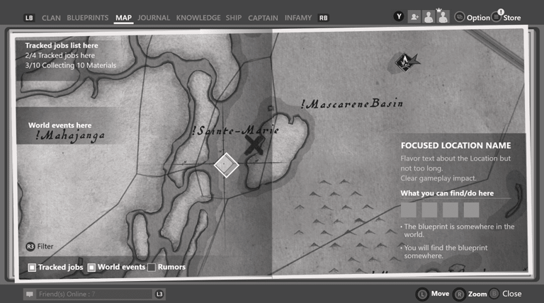
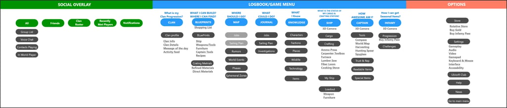
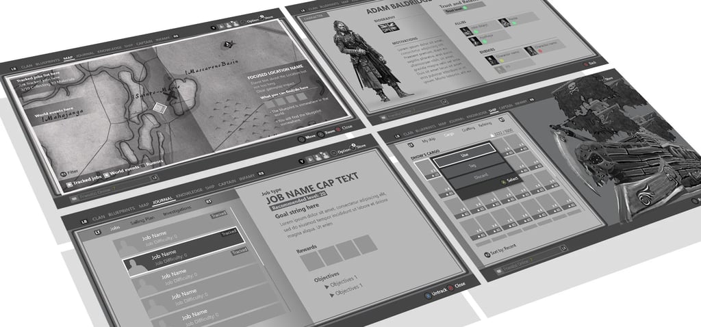
From 20+ features, we refined the structure into 8 main tabs, each answering a high-level player question:
Clan - What is my Clan Progression?
Blueprints - What Can I build/find?
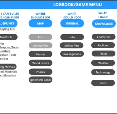
Map - Where should I go?
Journal - What could I do?
Knowledge - What do I know?
Ship - What is the status of my Cargo/Crafting station?
Captain - How awesome am I?
Infamy - How can I get season items?
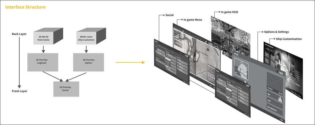
I made the structural call to split the system into three layers instead of one flat menu.
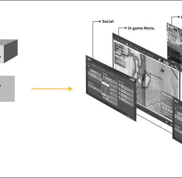
Rather than keep negotiating over a single list, I defined three distinct layers — Logbook (diegetic/world-facing), Option (support), Social (communication) — so each studio's features had an obvious, defensible home. That one decision resolved a large share of the placement disputes before they started.
We prioritized accessibility options at the start, ensuring players had essential setup tools available without overwhelming them.
Key balance:
For players who need accessibility settings → give robust options upfront.
For players who don’t → allow them to get into the game quickly without unnecessary friction.
I built in an ongoing review, not just a one-time deliverable.
A UX guideline that ships once and is never revisited drifts within a quarter on a project this size. I set up a weekly UX/UI review cadence specifically to keep 30+ designers across studios aligned to the standard as the game kept evolving, rather than treating the guideline as a document to hand off and walk away from.
What Shipped
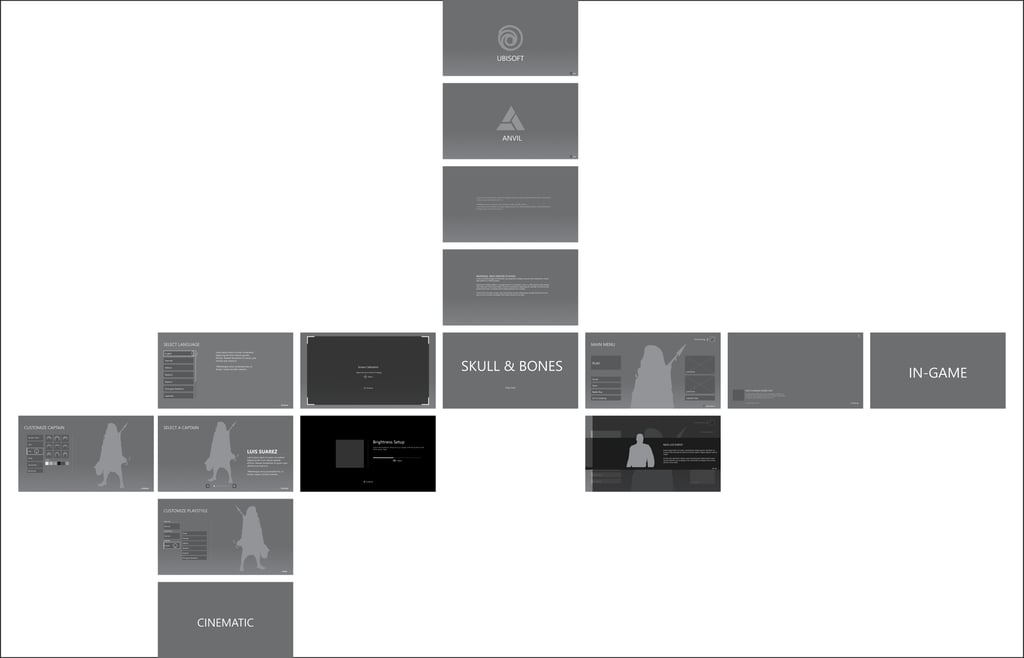
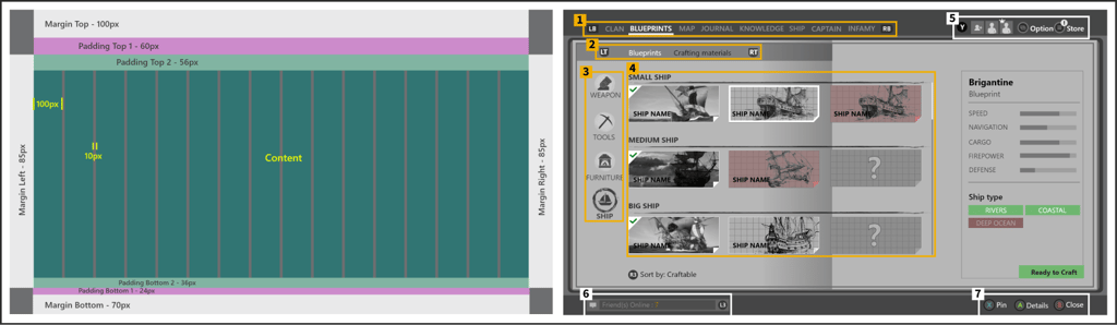
A cross-studio Meta-Game Menu UX Guideline covering UX vision and principles, information architecture, layout and grid standards, control scheme and interaction rules, camera/animation usage in menus, and typography and localization standards — plus the three-layer IA and 8-tab structure (Clan, Blueprints, Map, Journal, Knowledge, Ship, Captain, Infamy) that replaced the original 20+ feature proposals.
Some examples below:
Layout & Interaction Structure


Layout Composition Principles
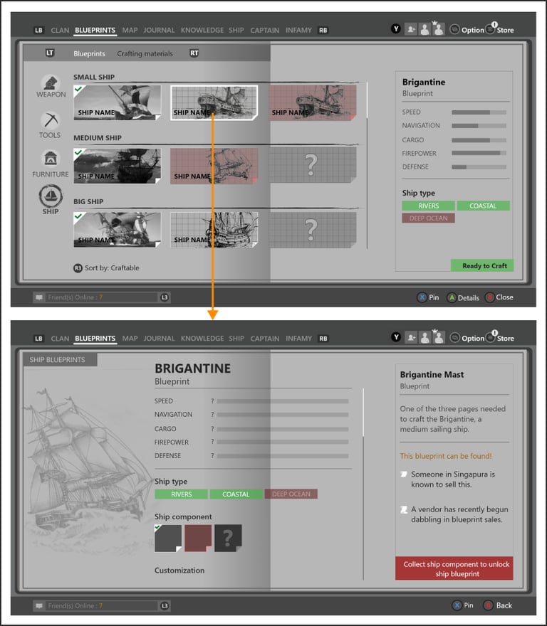
Details on Demand
Present essential info upfront.
Allow deeper exploration for customization and advanced details.
Reduce overload by progressively revealing complexity.
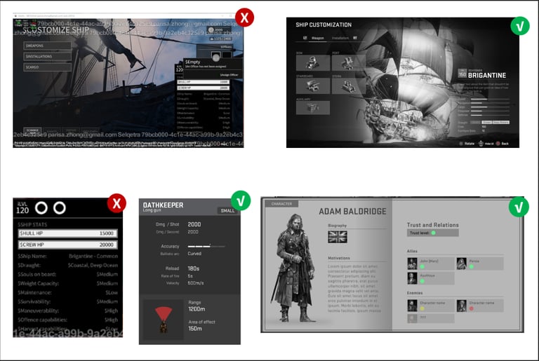
Intuitive Navigation
Define clear hierarchy of information.
Organize screens into primary, secondary, tertiary tiers.
Use visual grouping and hierarchy to reduce reading time.
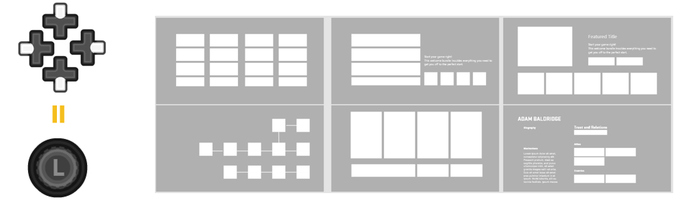
Interaction Principles
Menus across Skull & Bones shared a consistent navigation and interaction system, crucial for cross-platform usability.
D-Pad / XY Focus Navigation
Movement restricted to up, down, left, right.
Each object supports contextual actions (Equip, Craft, Access).
Clear visual distinction between interactive vs non-interactive objects.
Strong focus and selection indicators.
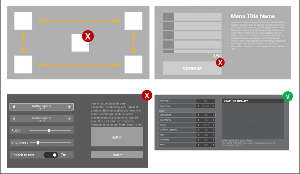
Special Case – Map Menu
Uses a free cursor centered on player position.
Designed to avoid inaccessible UI elements caused by XY focus limitations.
Avoided placing essential elements behind long scrolling lists/grids.
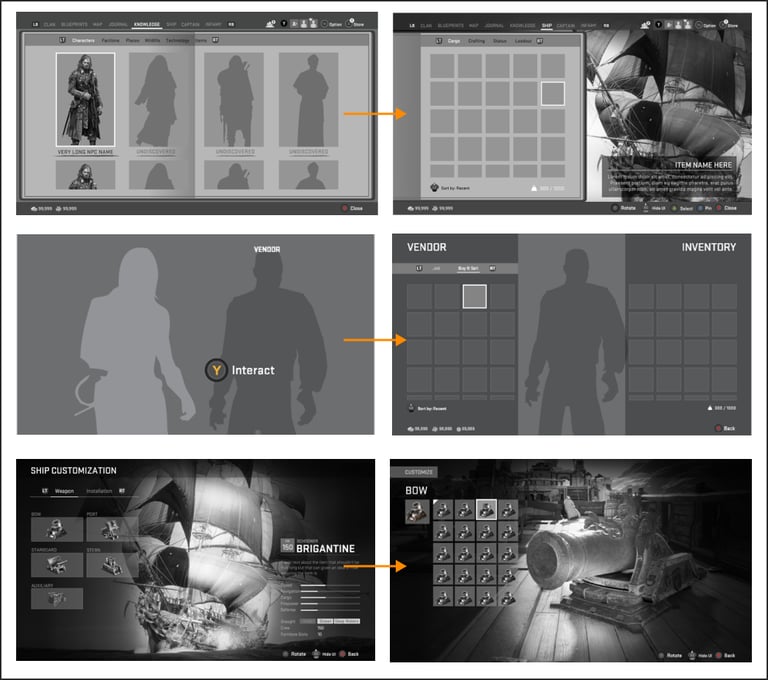
Camera & Animation in UI
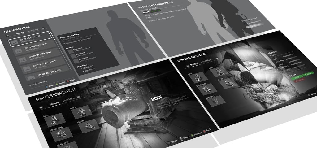
The camera was used to blend 2D menus with the 3D game world.
Guidelines:
Shift 2D UI to the side when presenting 3D objects.
Keep the camera position consistent when zooming between menus.
Prevent UI from obscuring 3D objects (use transparency where needed).
Ensure camera motion is smooth and frame-coherent to avoid disorientation.
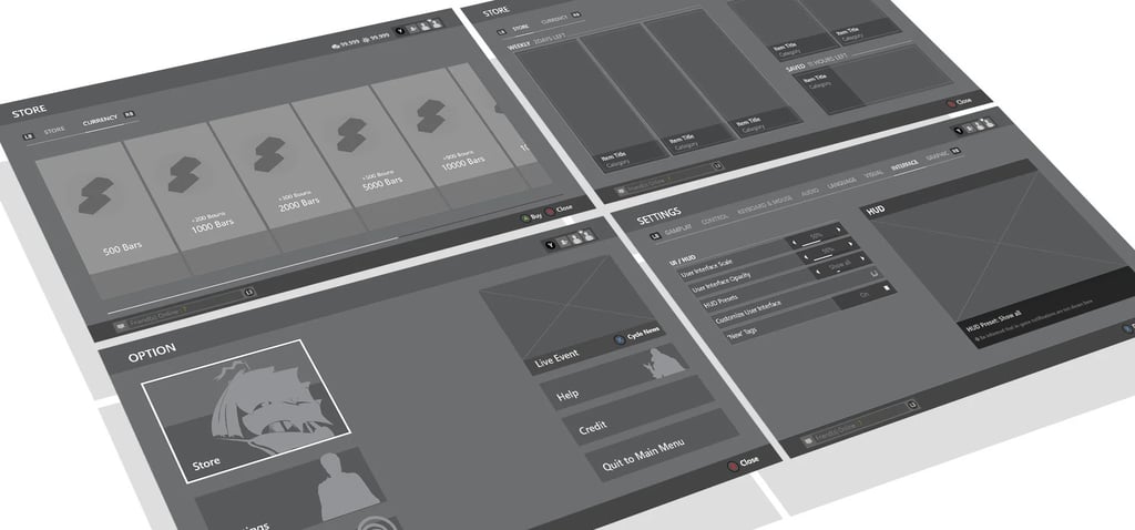
Some Wireframes
Results
The guideline held: the 8-tab structure and three-layer system shipped essentially intact through to the game's commercial release in February 2024, four years after I wrote it — evidence that the standard survived well past my own involvement, across teams and leadership changes, which is the actual test of whether a cross-org framework works. It gave five-plus studios a shared vocabulary and prevented the menu system from becoming the fragmented, feature-bloated experience the original 20+ proposals were heading toward.
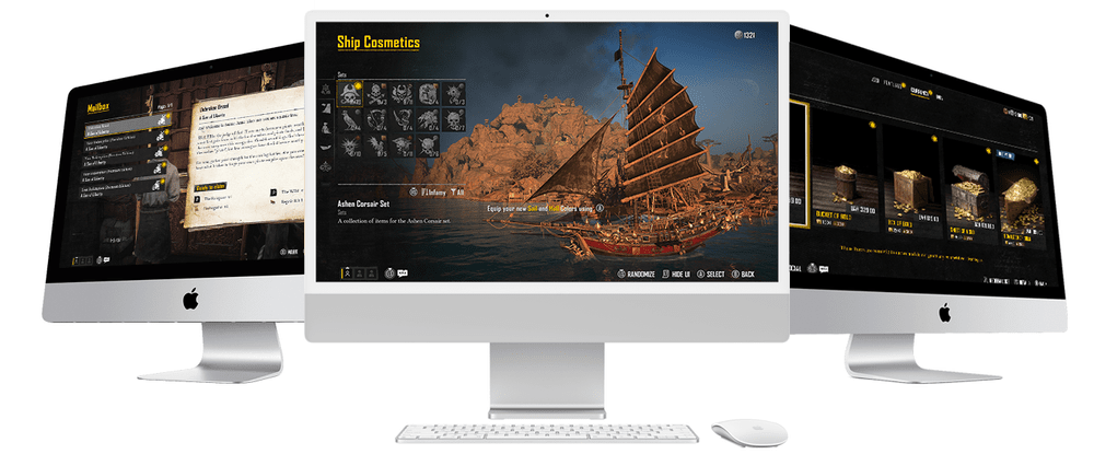
Below are some menu examples from the release version 2024


What I'd Do Differently
I'd bring studio leads into the room during the card-sorting phase itself, not just their designers. The framework got strong buy-in at the designer level, but a few early disagreements could have been resolved a full pass sooner if the studio leads had seen the tradeoffs being made in real time instead of hearing about them after the fact.