War Robots: Frontiers
UX & UI DESIGN# CONSOLE & PC
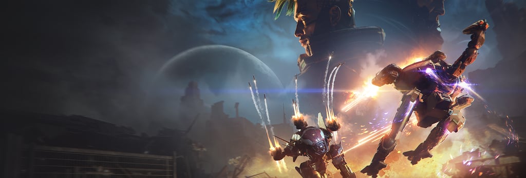
Position: Director of UX & UI
Project: War Robots: Frontiers
Duration: 2024 - 2025
Platform(s): PS4&5, Xbox One, Xbox Series X|S, PC
Tool(s): Unreal Engine 5, Figma
Team: UX/UI Designers & Artists (Roma Leontyev, Dmitriy Solonets, Aleksei Kovalev, Andrey Gonchar, Alexey Eremin); Animators (Fedor Novoselov, Maria Alaeva); Tech UI (Aleksey Zavada)

Introduction:
War Robots: Frontiers is a free-to-play, online multiplayer PvP mech shooter emphasizing competitive balance and long-term engagement.
As Director of UX & UI, I led the end-to-end player experience redesign, focusing on onboarding, accessibility, social features, monetization, and cross-platform usability to drive retention in a live-service title.
The situation
9 months before launch, leadership identified that our five-year-old Meta UX system was a launch risk. I was brought in to own the end-to-end redesign — across five design disciplines, six platforms, and a live production deadline that could not move.
The outcome
Cut onboarding abandonment by 25%, frustration scores by 35%
Beta DAU up 18% following launch
Cut design-to-dev rework by 40% by shipping a shared design system across a 8-person cross-discipline team
Delivered a clean cross-play debut on schedule, with zero slip to the production timeline
Why I Was Brought In
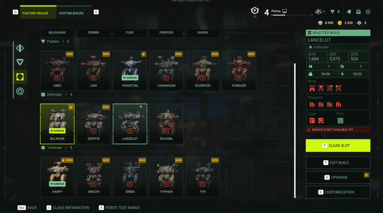
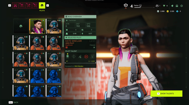
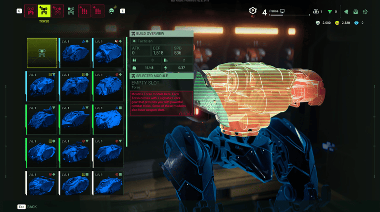
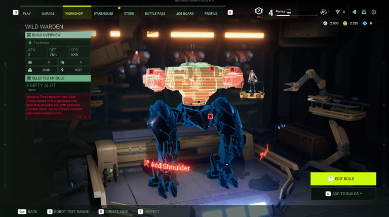
War Robots: Frontiers is a free-to-play PvP mech shooter competing in a crowded live-service market, where early retention determines whether a title survives its first quarter. 9 months from launch, research showed the game's core progression system — the "Meta," where players build and customize their mechs — was actively pushing new players away: over 30% abandonment in onboarding, driven by a non-linear, decision-heavy assembly flow that hadn't been touched in five years.
This wasn't a UI polish problem. It was a business risk sitting in the most-touched screen in the game, on a fixed launch date, across PC and three console platforms with fundamentally different input models. Leadership needed someone to own the redesign end-to-end — not just design it, but make the calls on scope, sequence the team's work against the deadline, and get buy-in from engineering and production to actually ship it in time.
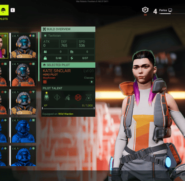
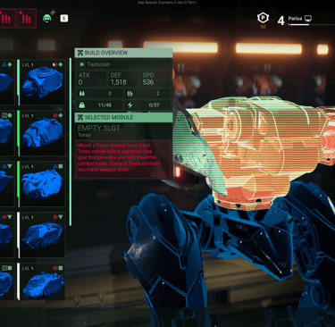
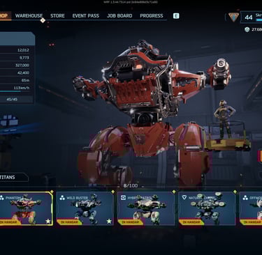
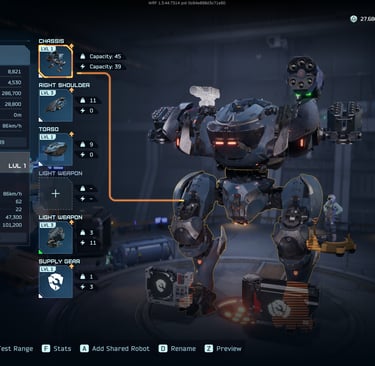
The old UI screenshot:
How I Approached It
I made the call to cut scope, not add it.
The instinct on a five-year-old system with this many stakeholders is to fix everything. I decided early that the only way to hit the deadline with quality was to isolate the single highest-leverage problem — the non-linear builder flow — and hold the line against scope creep from adjacent teams who wanted their features folded in. That tradeoff is what made a 9-month timeline realistic.
I built the team's shared language before I built any screens.
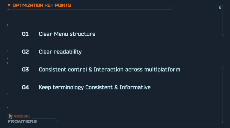
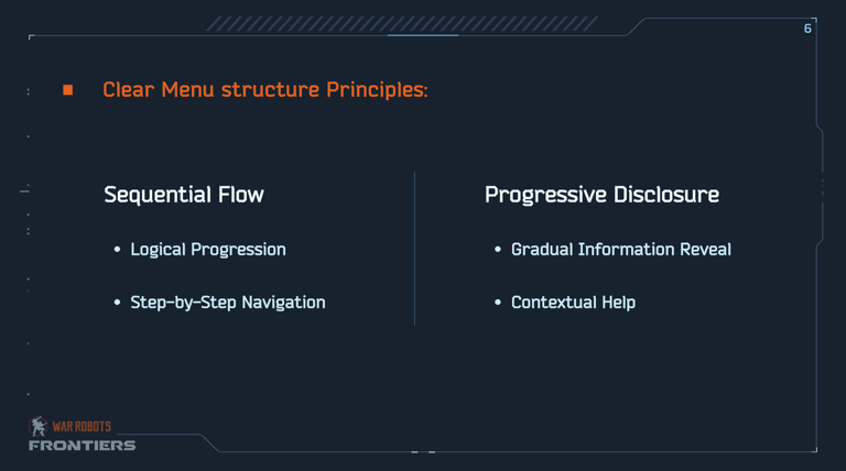
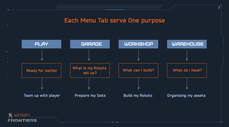
Engineers, artists, and animators didn't have a common UX vocabulary, which meant every design review turned into a debate about taste rather than a decision about the player problem. I ran a series of workshops to get the wider team fluent in the same principles we'd use to evaluate every screen going forward. That upfront investment is what let a team of designers, animators, and a tech-UI lead move fast later without me personally reviewing every screen.
I set the platform strategy, then delegated the execution.
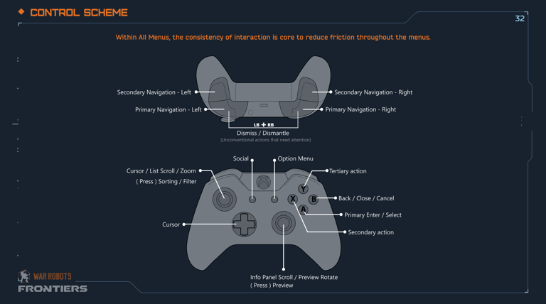
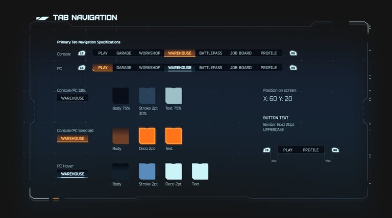
Rather than design separately for console and PC, I made the call to establish one input-agnostic interaction model — focus-based navigation for controllers, precise selection for PC — and had the team build against that single spec. This is what avoided a fork in the design system that would have doubled our review and QA load going into launch.
I used data to settle disagreements, not opinions.
When the team disagreed on how aggressive to be in simplifying the builder flow, I used playtest data on abandonment and frustration scores to make the case and get alignment from production. The same data streams we set up for that decision became the mechanism the Director Group used post-launch to prioritize the roadmap.
Key Deliverables
Proto-Personas & Journeys: "Casual Mech Pilot" (seeks quick wins) vs. "Competitive Builder" (deep customization).
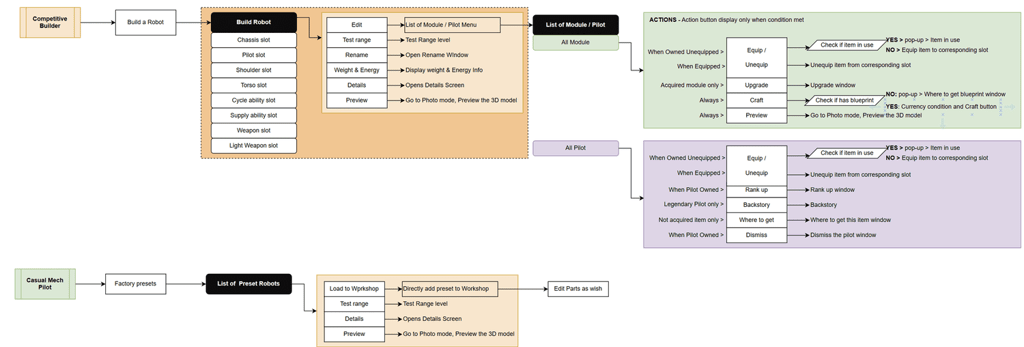
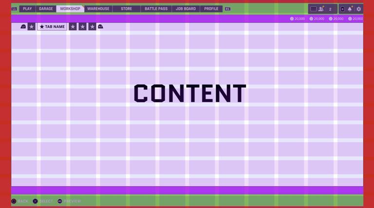
Wireframes & Prototypes: Low-fi sketches evolved to interactive Figma prototypes for builder overhaul. Emphasized modular components for scalability.
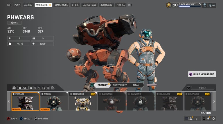
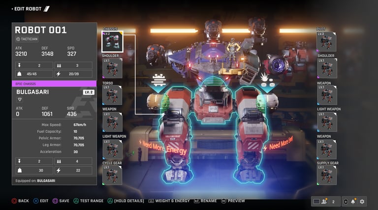
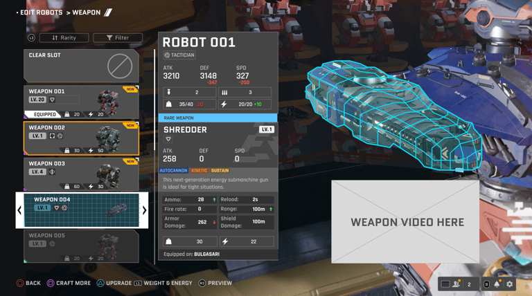
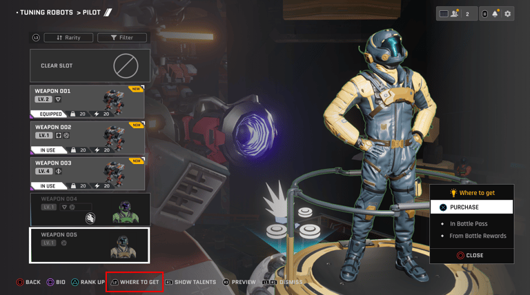
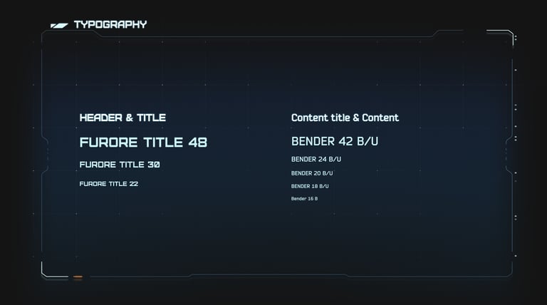
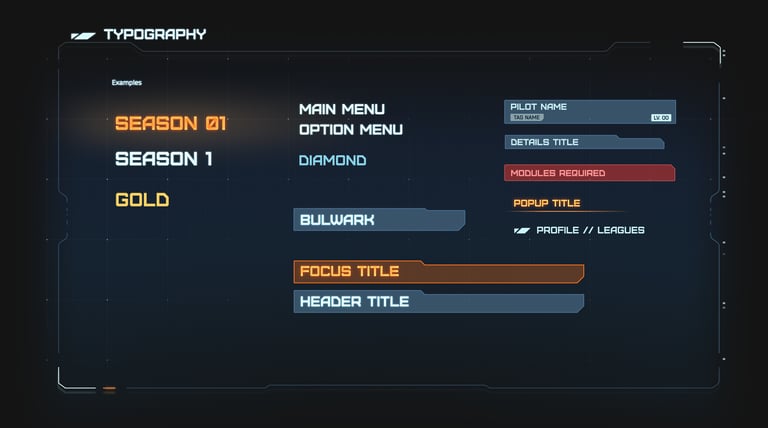
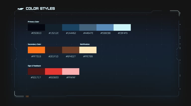
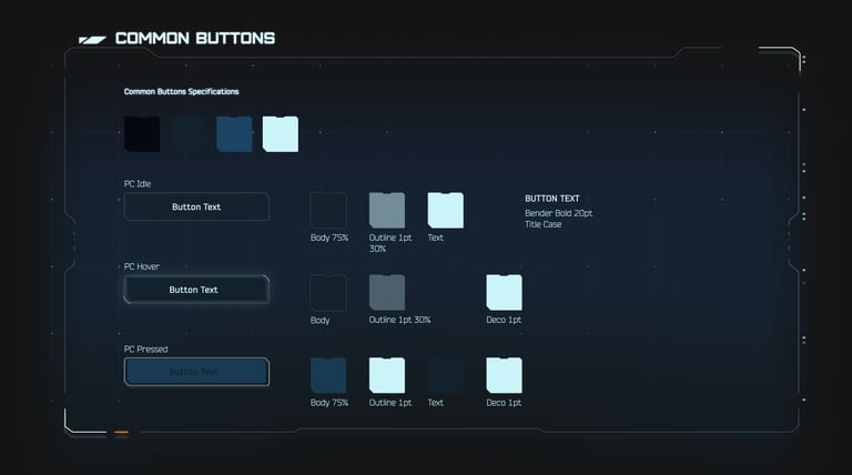
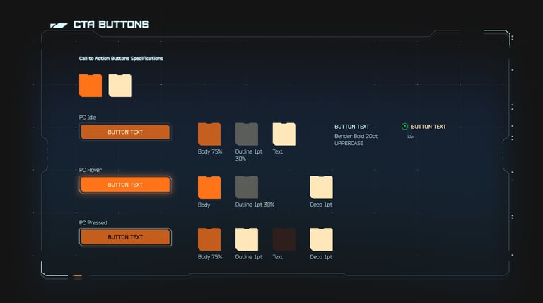
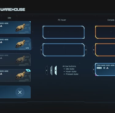
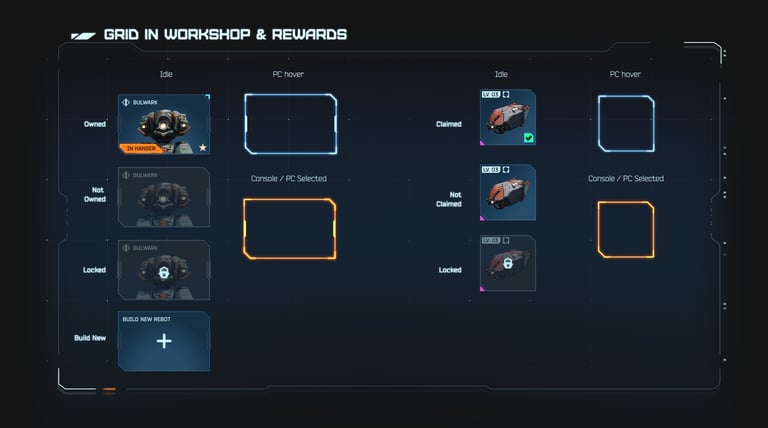
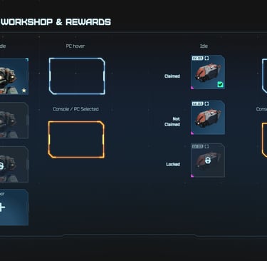
Design System in Figma: Comprehensive library with sci-fi-themed components, styles, and guidelines. Standardized handoffs, reducing rework by 40%.

What Shipped
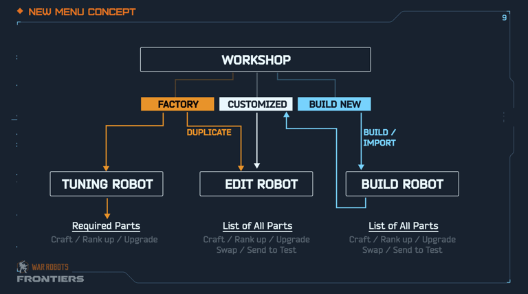
A redesigned Meta UX with linear, sequential build flows in place of the old open-ended assembly system; a single cross-platform interaction model covering console and PC; and a documented design system that let the team hand off components without re-litigating decisions each time. Team: 5 UX/UI designers and artists, 2 animators, 1 tech UI lead, reporting through me.
Results
Onboarding abandonment dropped 25% and frustration scores fell 35% against pre-redesign baselines.
The title launched cleanly across all platforms with no cross-play issues at debut, and beta DAU rose 18%.
The design system cut rework by 40%, which mattered beyond launch — it's the reason the team could keep shipping features post-launch without accumulating the technical debt that caused this problem in the first place.
The clearer data streams we built during the redesign are now what the Director Group uses to set both bug-fix priorities and the longer-term retention roadmap.
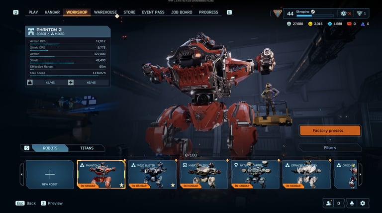
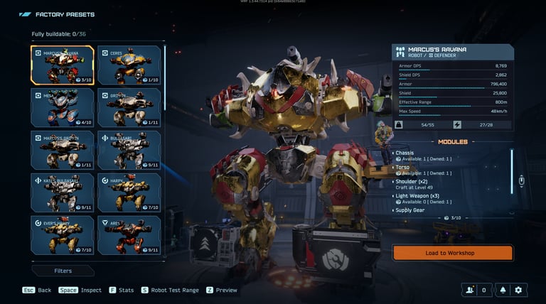
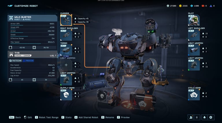
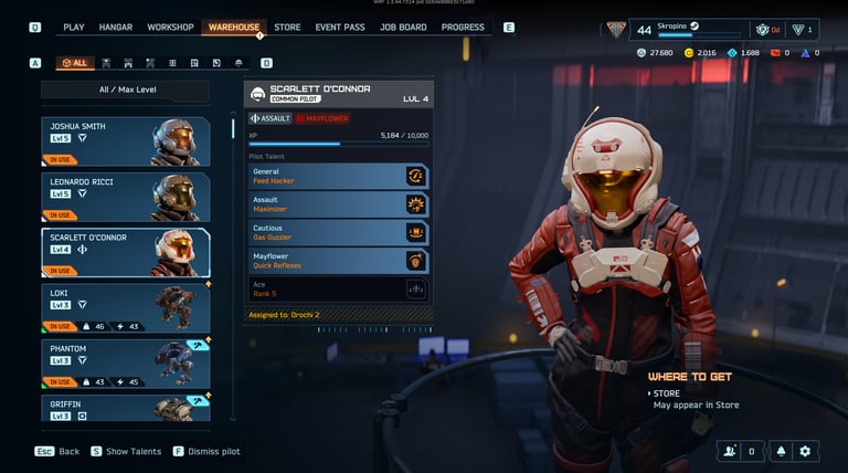
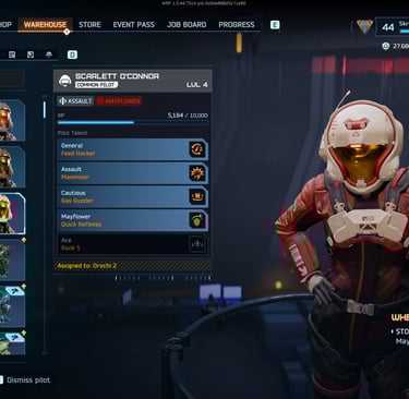
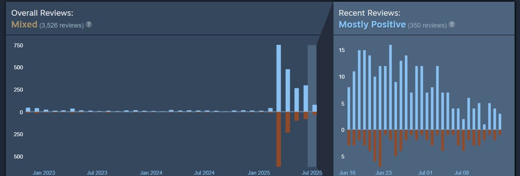
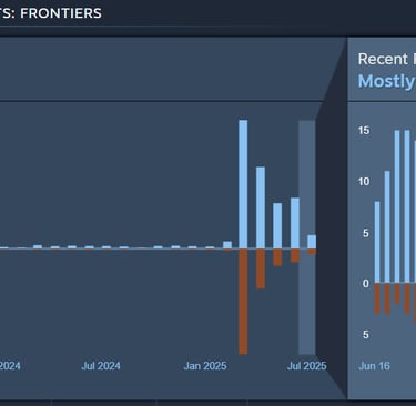
Soft-launched in March 2025; ongoing analytics guide feature prioritization.
What I'd Do Differently
I'd bring engineering into the workshop phase a full sprint earlier — we lost about two weeks re-explaining constraints that would have surfaced immediately if they'd been in the room from day one. On a title with this many stakeholders, the cost of alignment is always cheaper early than late.


