World of Tanks Blitz
A foundational UX guideline written to keep touch, mouse & keyboard, and gamepad players inside one consistent interface — without designing three separate games.
UX GUIDELINE# MOBILE & CONSOLE
Type: UX Guideline / Design System
Date: January 2023
#Cross-platform UX #Gamepad navigation #Menu architecture #HUD design #Accessibility
OVERVIEW
World of Tanks Blitz is a fast-paced PvP shooter with a massive global community of over 180 million players. You command a huge arsenal of over 600 vehicles from historical nations like the U.S., Germany, and the USSR, as well as fantasy and experimental tanks. Progression is built around researching and upgrading your machines through Tiers I to X, with unique hull and turret shapes influencing how you deflect enemy shells
CONTEXT
Why this guideline existed
World of Tanks Blitz had been live for over a decade when the studio decided to rebuild it from the ground up in Unreal Engine 5 — a total redesign, not an incremental update. I was assigned to establish the UX guideline the new build would be designed against, so that it worked correctly across phones, tablets, PC, and consoles from day one rather than being patched together per platform.
That meant answering one question before any screen got redesigned: how do we build a single interface that behaves correctly on touch, mouse & keyboard, and gamepad, instead of bolting a controller scheme onto a touch UI after the fact?
This wasn't a redesign of any specific screen. It was the rulebook the design team would use to build and evaluate every screen in the new UE5 build — menus, HUD, and everything in between.
GOAL
Set clear UX principles and guidance for the whole product
Easy to learn
Easy to navigate
Accessible to as many players as possible
Explicitly not the goal
Detailed feature design
A fix for existing feature-level issues
01 . THE PROBLEM
Three inputs, one interface, zero consistency
The existing UI had grown up touch-first over ten years. Controller support was layered on top rather than designed in, and it showed — a pattern the UE5 rebuild couldn't afford to inherit.
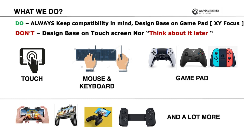
The same interface had to serve touch, mouse & keyboard, and gamepad players — with no shared source of truth for how each should behave.
What was actually breaking: the free-cursor layout used for touch wasn't adaptable to gamepad. Button hints tacked onto the bottom of the screen were treated as a substitute for real controller navigation, not a solution. And interaction buttons meant different things from one screen to the next.
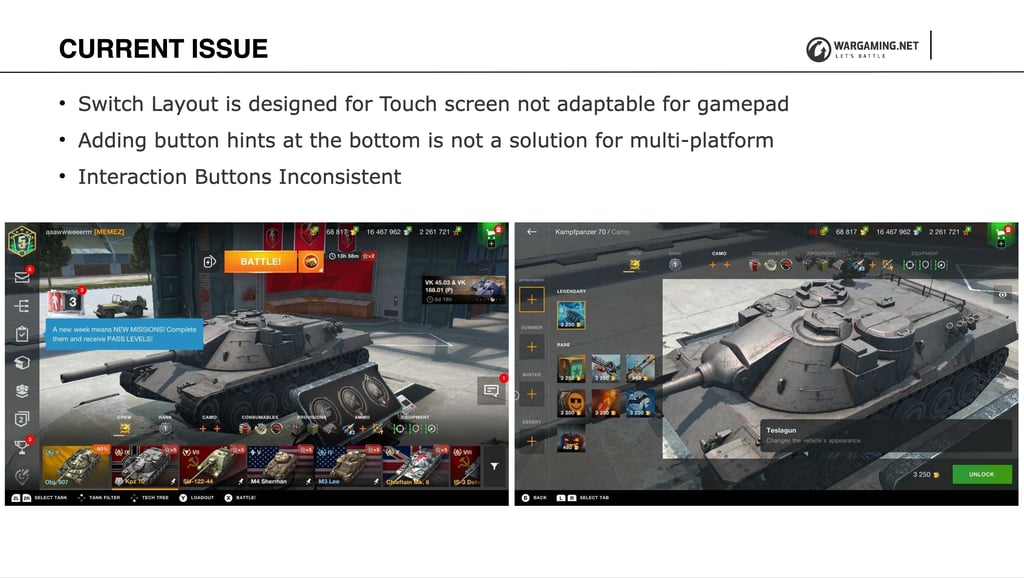
Interaction buttons and layout conventions drifted screen to screen — every menu was solving cross-platform input on its own.
The fix wasn't a patch. It meant deciding, up front, which input method the base layout should be designed for, and which should always be treated as an adaptation of it.
DON'T
Design for touch first, then "think about gamepad later."
DO
Design the base layout for gamepad (XY focus) and keep it compatible outward from there.
02 · Process — Navigation
Designing for the hardest input first
Gamepad is the least forgiving input: no cursor, no tap, just discrete up/down/left/right focus moves. So instead of retrofitting controller support onto a touch layout, I flipped the order — every layout had to work as XY-focus navigation first, and touch/mouse behavior was then layered on as a permissive superset.
01 Give the user proper control of the process (no hijacked scrolling, no forced camera behavior)
02 Path of least clicks — the fewest inputs between the player and their goal
03 One layout, multiple platforms — not one layout per platform
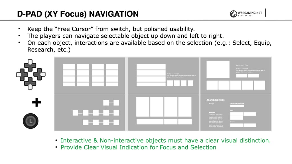
D-Pad (XY focus) navigation: players move focus up/down/left/right between selectable objects, each with its own contextual interaction (Select, Equip, Research). Interactive and non-interactive elements need unmistakable visual distinction.
XY focus has a hard constraint that a free cursor doesn't: because navigation is locked to four directions, any element that isn't in a clean row or column relative to its neighbors can become permanently unreachable by controller.
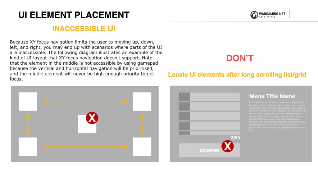
An element placed in the "middle" of a grid can lose out to horizontal/vertical navigation priority and never receive focus at all — this shaped how every layout grid in the game got built afterward.
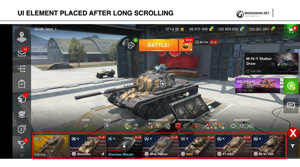
The same failure in the wild: a control buried at the bottom of a long scrolling list is effectively invisible to a gamepad player.
Default focus behaves differently per input — on purpose
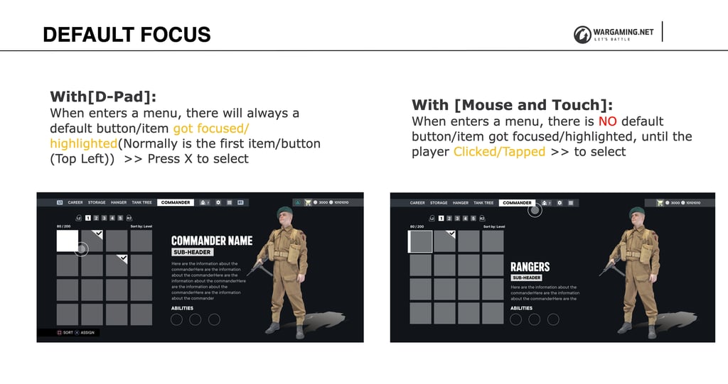
With a D-Pad, a menu always opens with an item already focused (top-left, by default) — press to select. With mouse and touch, nothing is pre-focused until the player actually clicks or taps. Same menu, two legitimate defaults.
Scrolling got the same treatment: the player, not the system, controls scroll speed and direction — stick or D-Pad input maps proportionally to scroll velocity — and every scrollable list needs a visible indicator of position and total length, on every platform.
03 · Solution — Menu System
Every menu earns its place
The second issue was informational, not navigational: players were overwhelmed because content wasn't sorted, organized, or categorized around what they actually needed to know, and iconography didn't reliably communicate what a menu was for.
I reframed every top-level menu around the question it exists to answer for the player — not the feature it happened to expose.
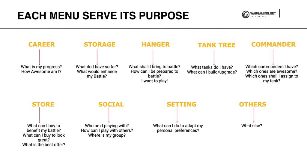
Career, Tank Tree, Hangar, Commander, Store, Social, Storage, Settings — each menu maps to a specific player question ("What tanks do I have?", "What shall I bring to battle?"), which is what actually determined its content and hierarchy, not the other way around.
The governing rule: every menu in the new system shares the same navigation and interaction pattern. Consistency across menus — and across platforms — is what makes the whole system learnable in the first place.
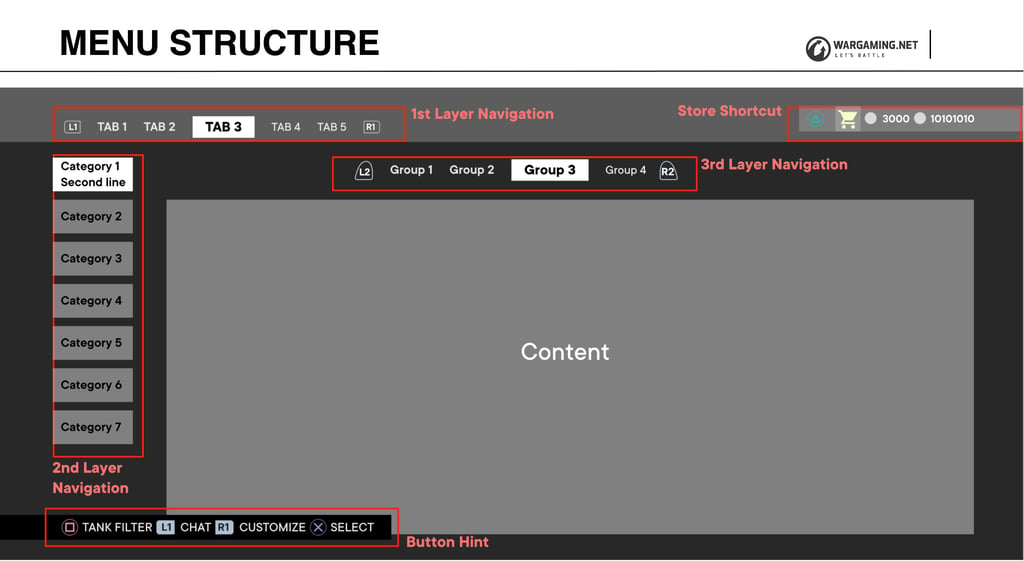
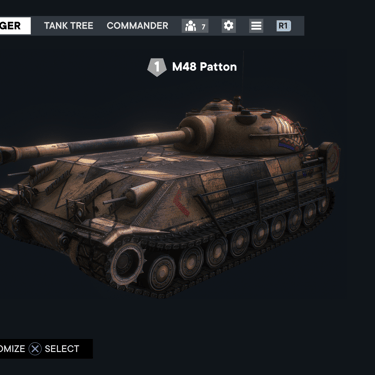
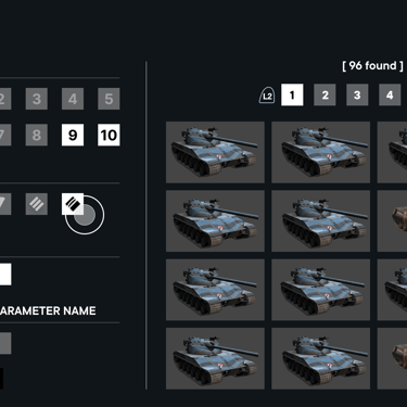
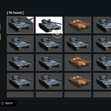
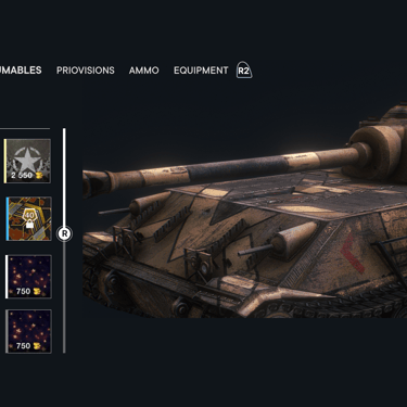
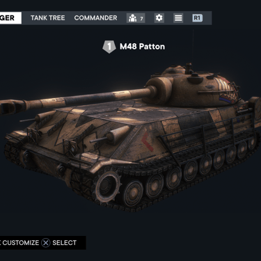
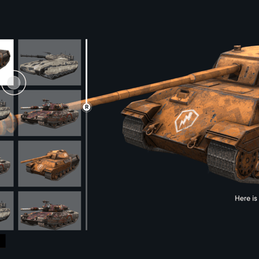
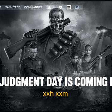
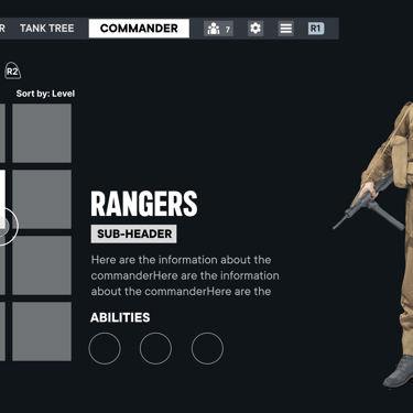
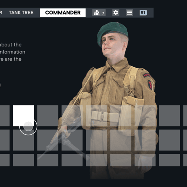
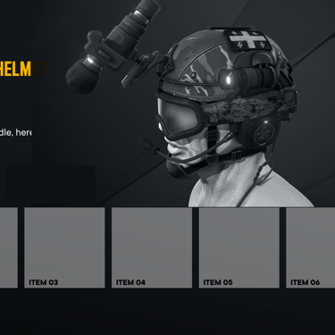
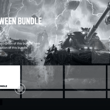
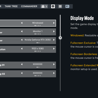
A single structural template — tab navigation, grouped categories, a layered content region — reused across every menu so a player who learns one menu has effectively learned them all.
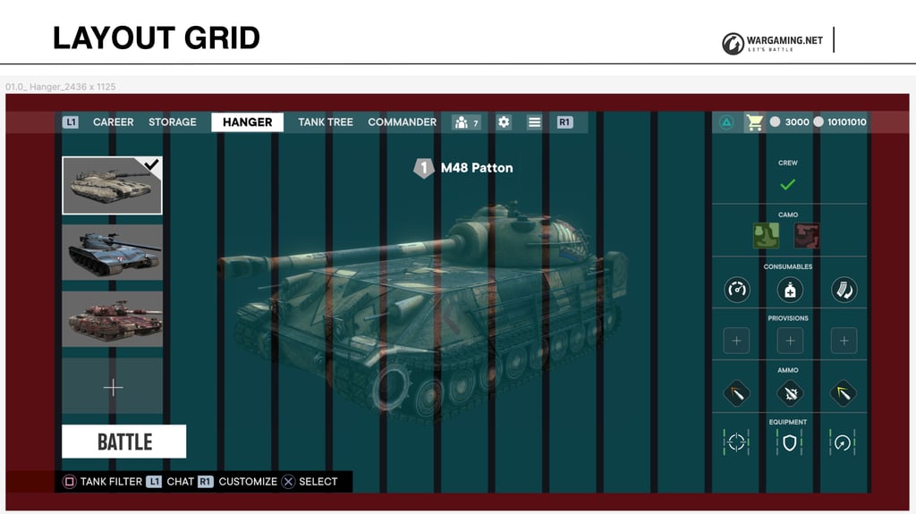
The structural template mapped onto a real screen, grid and all — proof the system held up outside the diagram.
04 · Solution — HUD
Quiet by default, loud when it matters
The HUD guideline pushed back on a common instinct on the team: that any new gameplay feature needed its own dedicated HUD element to "explain" itself. Instead, the HUD's job is to manage the player's attention, not narrate every system.
Five HUD principles, in order of how often they got violated in practice: simplicity, legibility, strategic placement, appropriate iconography, and platform awareness.
Informative Give the player what they need, exactly when they need it — no earlier
Consistent Same actions, same colors, everywhere
Quiet Don't steal the thunder from gameplay
To make "when they need it" concrete, I mapped a full pre-match flow screen by screen and tested every element against one question: does this screen serve its purpose right now?
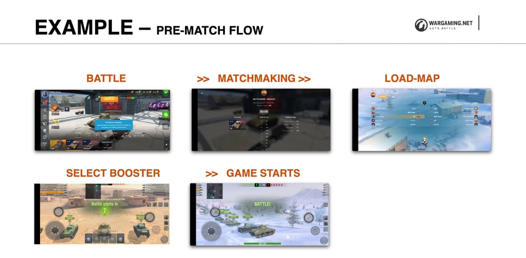
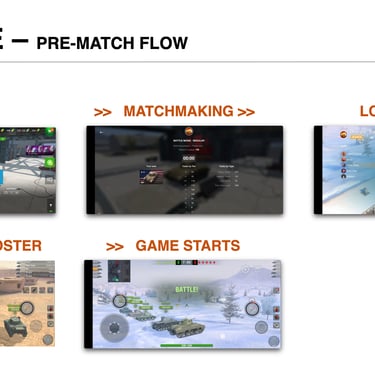
Battle → Matchmaking → Load Map → Select Booster → Game Starts, each screen scoped to the one or two questions the player actually has at that moment (who am I playing with, how long will this take, what's my objective).
That same discipline shaped the in-match HUD itself. Rather than a flat pile of widgets, information got layered by urgency — from center-screen critical prompts ("Low health — press to heal") down to on-demand information the player only needs on request, like the full player list or map.
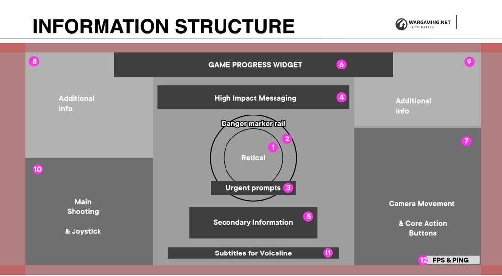
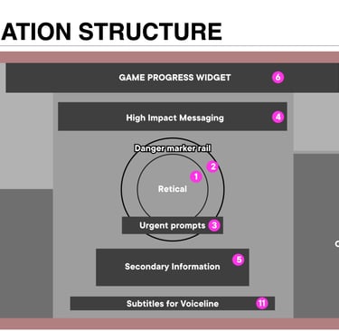
The HUD's information hierarchy — from urgent, center-screen prompts down to secondary, on-demand information — with each widget assigned a z-order layer so design and engineering could reorder or tweak independently.
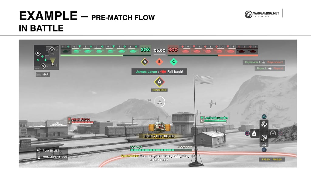
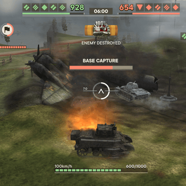
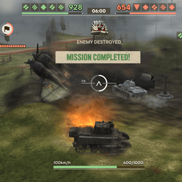
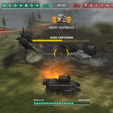
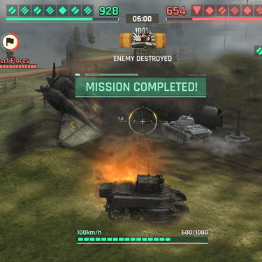
The hierarchy applied in battle: eliminations, objective status, and player feedback surface without competing with the moment-to-moment combat read.
The remainder of this Guideline is omitted here.
OUTCOME
What this guideline actually changed
It didn't ship as a feature — it shipped as the shared reference the team used to build and critique every menu and HUD screen in the UE5 rebuild. Its real output was alignment: a documented, testable answer to "does this work on gamepad?" that didn't depend on someone remembering to ask.
Concretely, it gave the team: a single navigation model (XY focus) that touch and mouse interaction could be layered on top of instead of designed separately; a repeatable menu template so new menus inherited consistent behavior by default; and an information hierarchy for the HUD that made "do we need this on screen right now?" an explicit design question instead of a habit.
It also became the natural home for platform requirements that used to live in individual designers' heads — accessibility guidelines and platform TRCs (technical requirement checklists) included — so those constraints got checked at the guideline level, before a screen was built, rather than caught in certification after.